Addressing Healthcare Disparities in Chicago's African-American Communities


Introduction
Chicago's diverse landscape is a tapestry of varied socio-economic and ethnic communities. Among these, African-American neighborhoods stand out, not just for their rich cultural heritage but, unfortunately, also for the stark healthcare disparities they face. Recent data analyses shed light on an alarming shortage of healthcare providers in these areas, revealing a significant gap in access to essential health services. This post delves into these findings, underscoring the urgent need for more primary care providers and exploring innovative solutions like telemedicine and online prescription services to improve health outcomes.
The Stark Reality: A Look at the Data
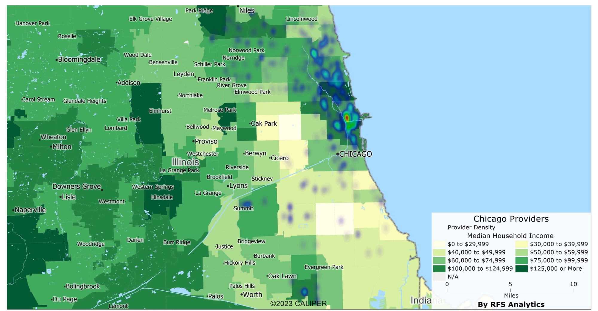
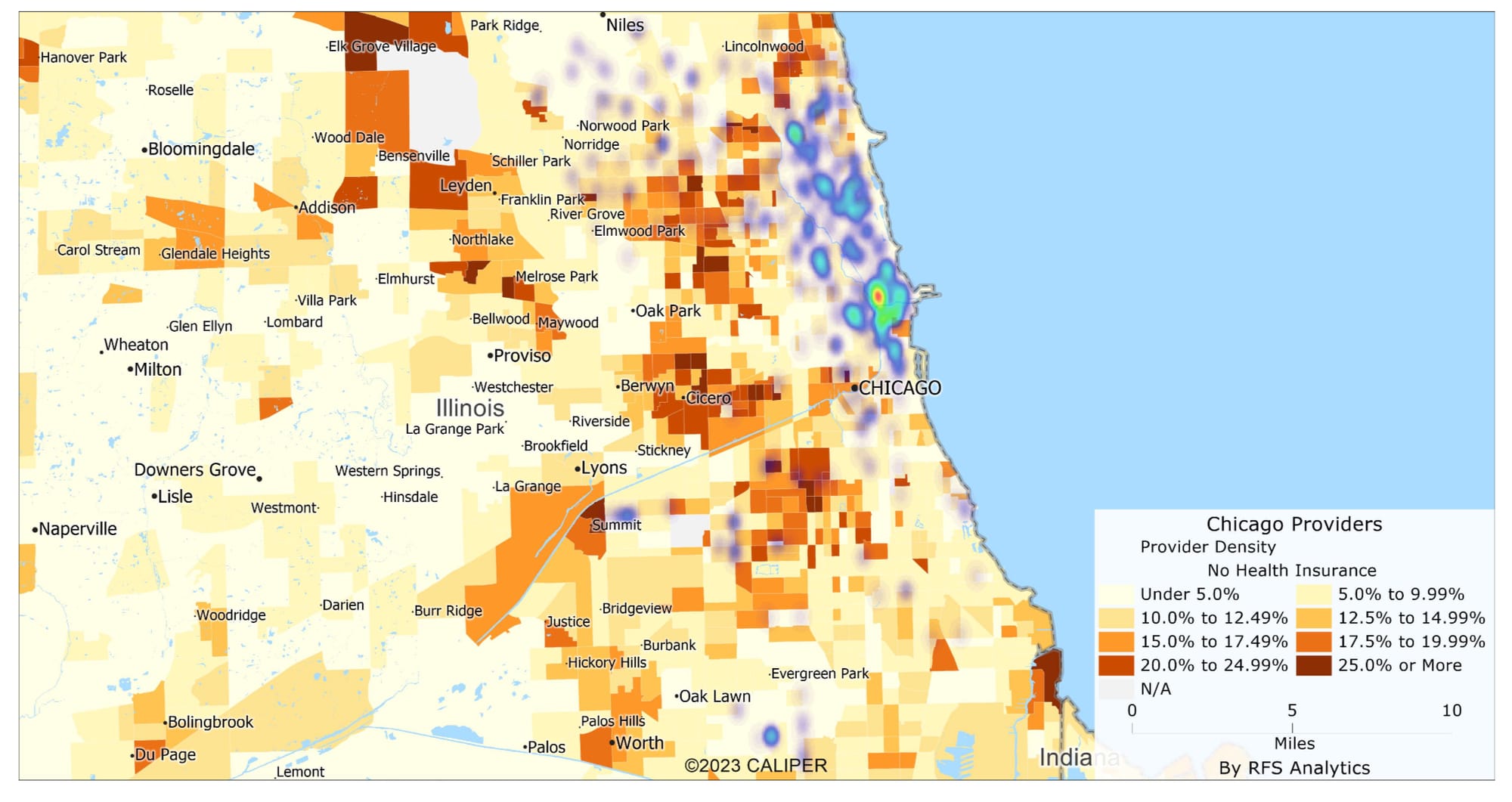
Heat Map of Available Providers in Chicago
Among these, African-American neighborhoods stand out, not just for their rich cultural heritage but, unfortunately, also for the stark healthcare disparities they face.
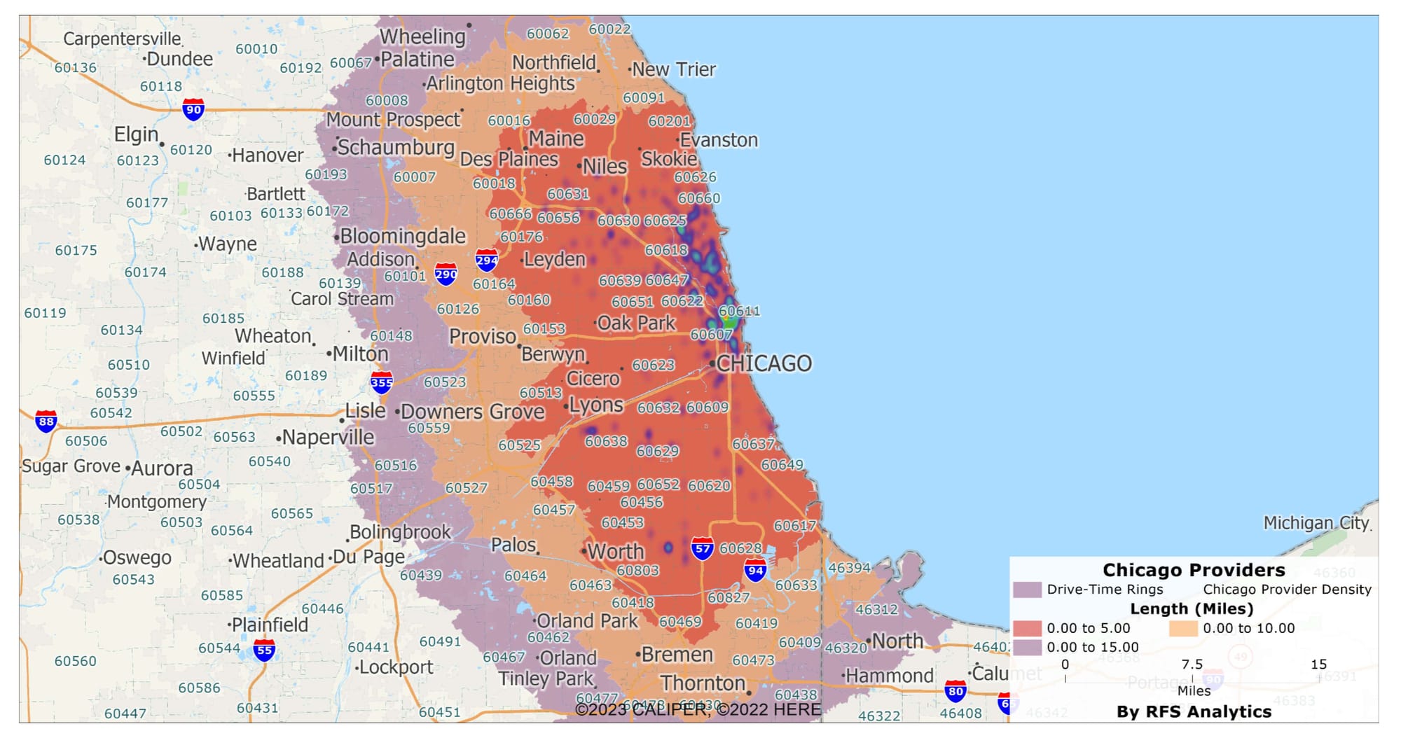
The heat map above visualizes the distribution of healthcare providers across Chicago. The darker areas indicate lower provider density, which, as the data suggests, aligns closely with predominantly African-American ZIP codes.
Our analysis of healthcare provider availability within Chicago's diverse landscape presents a compelling narrative about the intersection of socio-economic status and access to healthcare. Geocoding and correlating the data with the drive-time rings has illuminated some disconcerting trends. In areas within the 0-5 miles ring, where the median income is relatively lower and the percentage of African-American residents is higher, there's a marked deficiency in the number of healthcare providers, including chiropractors and DOs. This scarcity becomes even more pronounced in the 5-10 miles and 10-15 miles rings, where the population is increasingly African-American.
The drive-time rings also reflect a correlation with other demographic attributes such as education and household income. ZIP codes that are home to higher numbers of TANF families, single-headed households, and residents living below the poverty line similarly experience a shortage of healthcare services. These areas, which also have lower educational attainment levels, suggest systemic neglect, where those in need of primary care and prescription services are the ones with the least access.
Interestingly, the data reveals that this pattern of healthcare provider scarcity does not improve in areas with a larger population of minorities. Instead, it highlights a disparity that requires immediate attention and action. These insights underscore the necessity for targeted healthcare policies that address the shortage of providers and consider the socio-economic barriers that contribute to healthcare inequities.
By identifying the ZIP codes most affected by these disparities, we can prioritize interventions, such as the introduction of telemedicine and pharmacy delivery services, to improve healthcare access. These solutions are not just stopgap measures but are critical steps towards a more equitable healthcare system that aligns provider availability with community needs, particularly in areas with significant African-American populations and socio-economic vulnerabilities.
The Socio-Economic Correlation: Income, Education, and Healthcare Access
The availability of healthcare providers in Chicago reveals a stark pattern that extends beyond simple geography, delving into the socio-economic dynamics of each community. Our detailed analysis uncovers a significant correlation between healthcare provider density and socioeconomic indicators such as median income and education levels. Neighborhoods grappling with lower median incomes and higher poverty rates face a notable scarcity of healthcare services. This disparity is acutely observable in predominantly African-American and Hispanic ZIP codes, underscoring a troubling intersection of economic hardship and healthcare inaccessibility
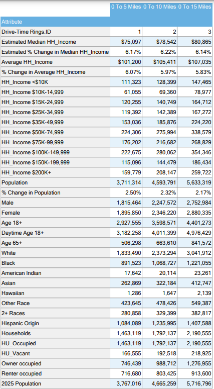
Provider Availability by Various Demographic Factors
Median Income vs. Provider Availability
This map reveals the relationship between median income levels and the availability of healthcare providers in Chicago. Areas with lower median income tend to exhibit a striking shortage of healthcare facilities, including pharmacies and primary care providers. The map color codes each ZIP code based on median income, allowing for a clear visual comparison with the density of healthcare providers. This contrast highlights a crucial socio-economic disparity, where economically disadvantaged areas are also those most underserved in healthcare.
Education Levels vs. Healthcare Accessibility
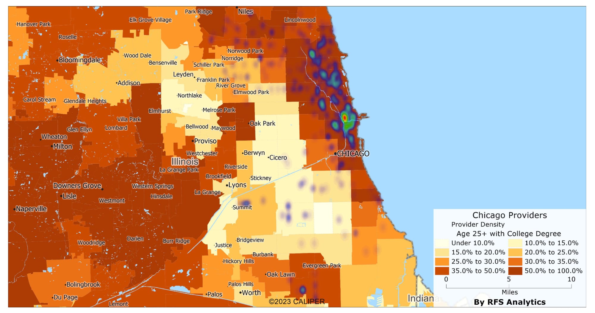
This section focuses on the correlation between education levels across Chicago's ZIP codes and the accessibility of healthcare services. The map illustrates that neighborhoods with lower educational attainment often coincide with a lack of healthcare providers. This visual representation underscores the intersection between educational and healthcare disparities, signaling a need for targeted interventions in these communities.
Age Demographics vs. Provider Distribution
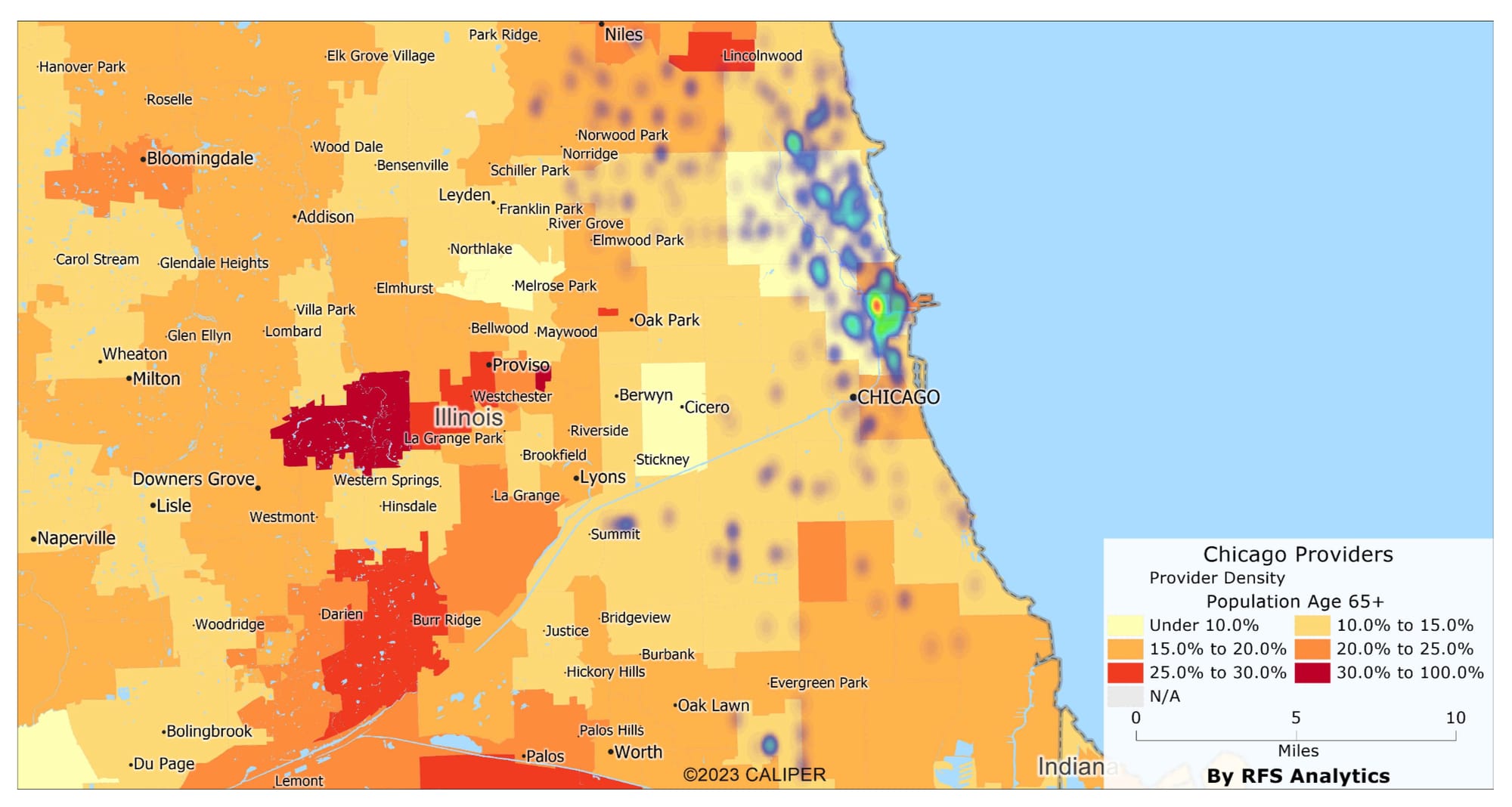
Exploring the age demographics in relation to healthcare provider distribution offers insightful perspectives. This map displays how areas with younger or older populations are serviced in terms of healthcare access. It particularly highlights how the distribution of providers does not always align with the needs of the demographic profile, especially in areas with vulnerable age groups like the very young or elderly.
TANF Families, Single-Headed Households, and Provider Availability
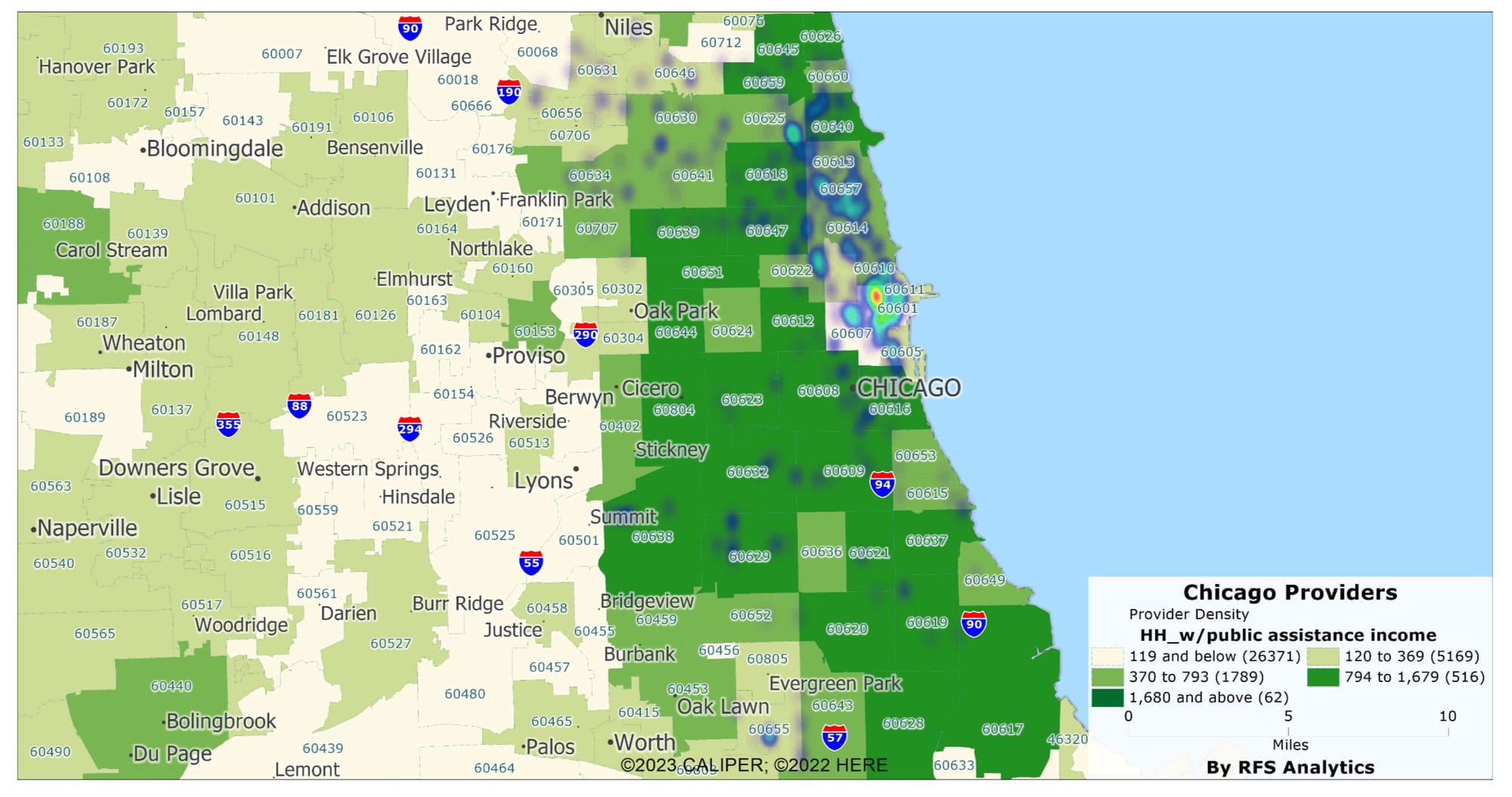
This map sheds light on the impact of TANF (Temporary Assistance for Needy Families) recipients and single-headed households on healthcare access. Areas with a higher concentration of these demographics often face a more pronounced healthcare provider shortage. The map reveals a compelling story of how these vulnerable groups are located where healthcare services are scarce and critically needed.
Poverty Levels and Provider Shortage
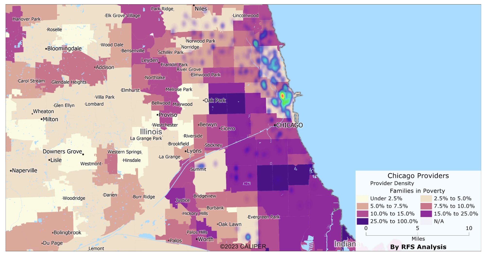
The correlation between poverty levels and the scarcity of healthcare providers is starkly illustrated in this map. It highlights ZIP codes with higher poverty rates and their corresponding access to healthcare services, revealing a clear pattern: the higher the poverty, the lower the availability of healthcare providers, including essential services like pharmacies.
Unemployment Rates vs. Provider Availability
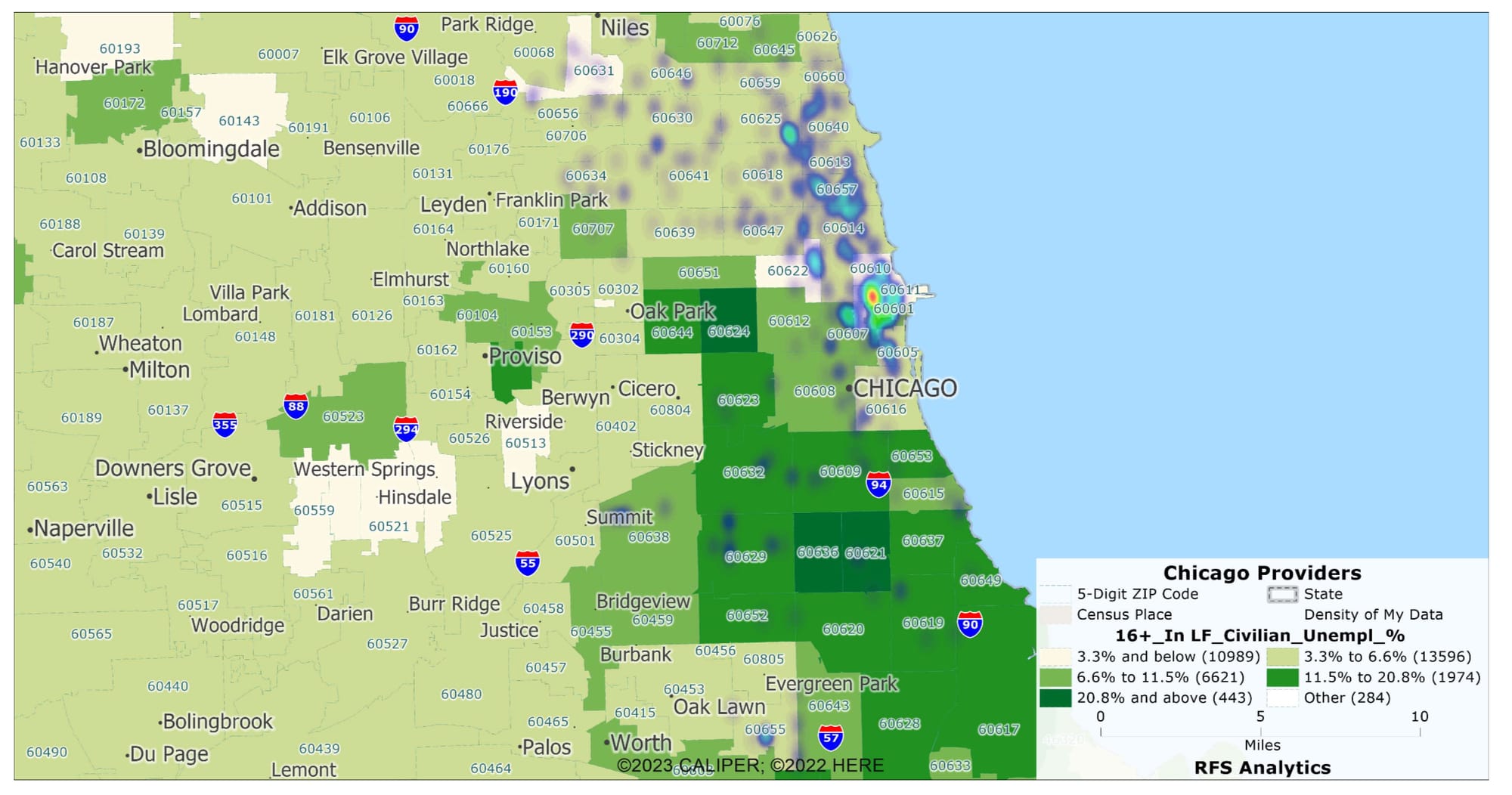
This map intricately connects the dots between unemployment rates in various Chicago ZIP codes and the availability of healthcare providers. Areas marked by higher unemployment often coincide with a severe scarcity of healthcare resources, including pharmacies and clinics. The map will use varying shades to indicate unemployment rates across different neighborhoods, juxtaposing these figures against the density of healthcare providers. This contrast highlights the healthcare gap in areas of economic distress and emphasizes the need for increased healthcare support in communities where unemployment is rampant.
Uninsured Rates vs. Provider Availability
This map will delve into the relationship between uninsured individuals' rates and healthcare providers' availability, broken down by census tract in Chicago. It will graphically represent areas with higher percentages of uninsured residents, highlighting how these areas often align with a notable shortage of healthcare services. By color-coding census tracts based on the proportion of uninsured individuals and overlaying this data with the locations of healthcare providers, the map will provide a stark visual representation of the challenges faced by uninsured populations in accessing healthcare. This visual aid is crucial in identifying the census tracts that most need increased healthcare access, particularly for those without insurance coverage.
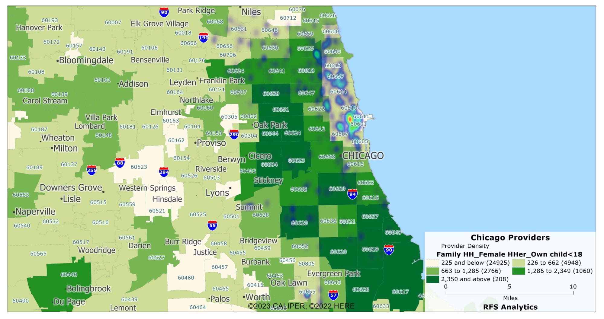
Black and Hispanic Populations vs. Provider Availability
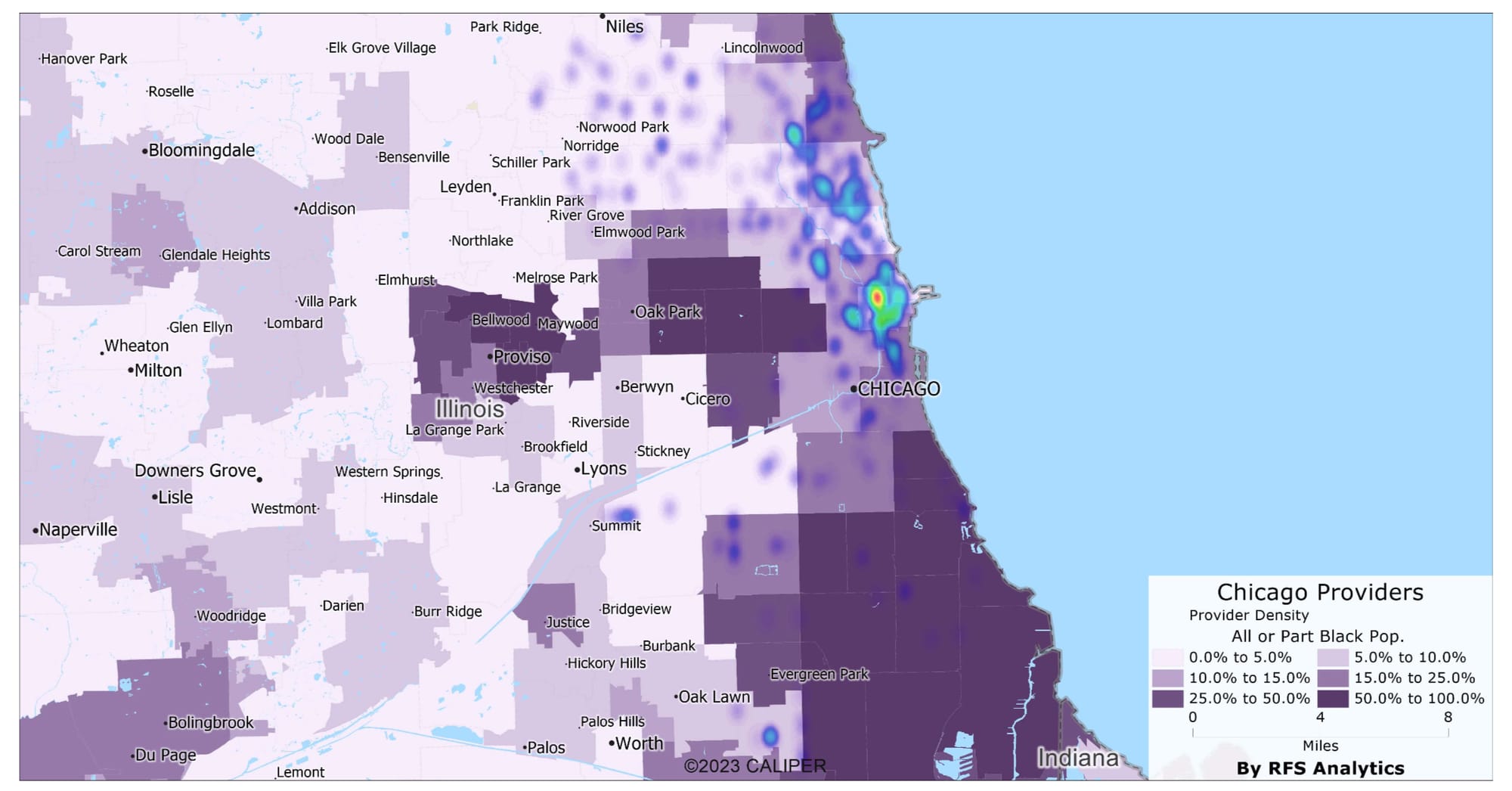
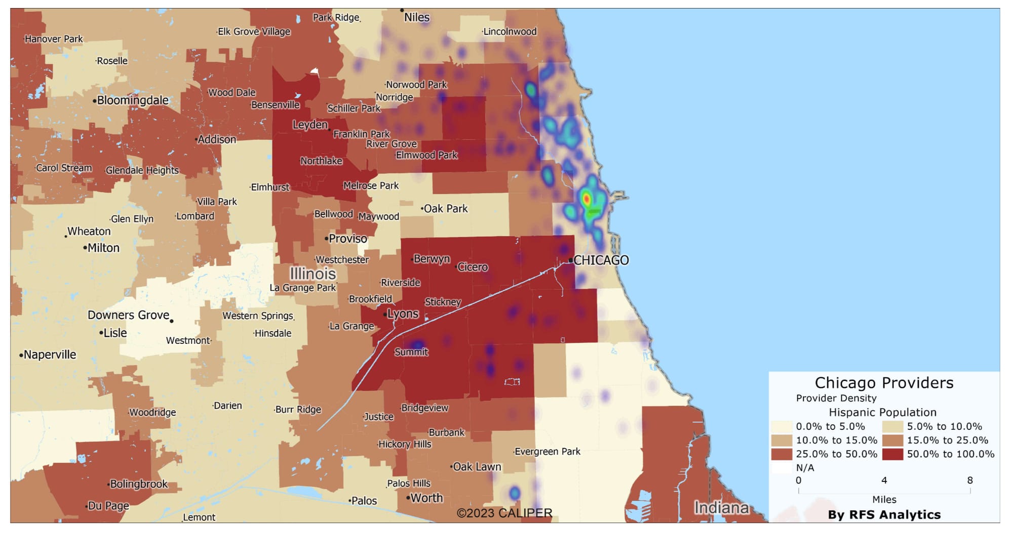
This section features a map that correlates the distribution of African-American and Hispanic populations in Chicago with the availability of healthcare providers. It becomes evident that these racial demographics, particularly in areas with higher concentrations of Black and Hispanic residents, often coincide with a noticeable lack of healthcare services. This visual tool underscores the racial disparities in healthcare access and the necessity for equitable healthcare distribution.
Analysis of healthcare provider availability in ZIP codes with significant African-American populations reveals a troubling trend. There's a clear deficit of primary care providers, including those capable of prescribing medications.
Population vs Provider Ratio Chart
The following bar chart illustrates the significant discrepancy between the population and provider counts in predominantly African-American ZIP codes in Chicago. The substantial difference in these counts across almost all ZIP codes highlights the urgent need for more primary care providers.
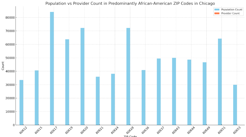
The bar chart here starkly illustrates the disparity between the population size and the number of providers. The absence of providers is particularly pronounced in areas like 60624, 60628, and 60644.
Systemic Challenges and Healthcare Provision
The correlation between provider availability and socio-economic factors such as median income, education levels, age distribution, TANF families, single-headed households, and poverty levels is evident. This chart underscores how areas with lower socio-economic status, including many African-American and Hispanic ZIP codes, suffer from reduced access to healthcare.
Impact on Health Outcomes
The following conceptual chart represents the projected improvement in health outcomes with increased access to primary care. It compares two scenarios: "Limited" and "Improved" access to primary care. The chart uses hypothetical data to illustrate:
- Emergency Room Visits: A significant decrease in emergency room visits is expected with improved primary care access, indicating better routine care and early intervention.
- Management of Chronic Diseases: Improved access leads to better management of chronic conditions, reducing complications and improving quality of life.
- Overall Community Health: A general increase in the overall health score of the community is anticipated, reflecting better preventive care, routine check-ups, and health maintenance.
Potential Health Outcomes Improvement Chart
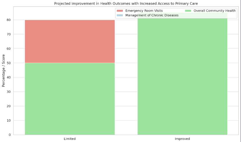
This conceptual chart projects the improvement in health outcomes with increased access to primary care. A significant decrease in emergency room visits and an increase in the effective management of chronic diseases are among the expected benefits.
Bridging the Gap with Technology
The graphic below depicts the role of telemedicine and pharmacy delivery services in improving healthcare access, especially in areas with limited in-person care. It compares these services based on hypothetical availability and effectiveness scores:
- In-Person Care: Represents traditional healthcare access currently limited in the identified ZIP codes.
- Telemedicine: Shows a high availability score, indicating its potential to provide widespread and accessible healthcare services. Its effectiveness score is also significant, reflecting the ability of telemedicine to address many healthcare needs effectively.
- Pharmacy Delivery: Illustrates a similarly high availability score, ensuring that prescriptions and medications are accessible even when physical pharmacies are not present. While slightly lower, its effectiveness score still demonstrates a valuable role in healthcare provision.
Telemedicine and Pharmacy Services Concept Graphic
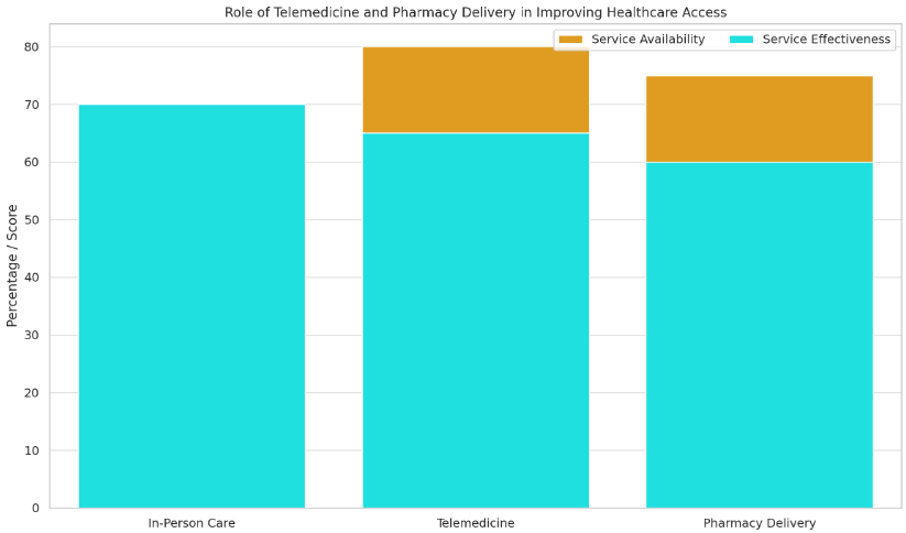
The role of telemedicine and pharmacy delivery services in these communities cannot be overstated. As the graphic suggests, these modern healthcare solutions offer a viable alternative to traditional in-person care, especially in areas where it's lacking.
Conclusion
The provided charts and graphics collectively tell a compelling story about the current state of healthcare access in predominantly African-American ZIP codes in Chicago and the potential for improvement:
- Critical Provider Shortage: The data reveals a substantial shortage of healthcare providers in these communities, which could lead to inadequate healthcare access and poorer health outcomes.
- Impact of Improved Access: Enhanced access to primary care, as shown in the conceptual charts, could significantly reduce emergency room visits, improve chronic disease management, and boost overall community health.
- Role of Modern Healthcare Solutions: Telemedicine and pharmacy delivery services emerge as vital solutions in areas where traditional in-person care is limited. They can provide essential healthcare services, improving accessibility and effectiveness of care.
The data paints a clear picture: Chicago's African-American communities are in dire need of more healthcare providers. The gap affects immediate health needs and has long-term implications for community well-being. By leveraging telemedicine and online prescription services, there's a hopeful path forward. These technologies can help bridge the healthcare divide, ensuring that residents in these underserved areas have access to the care they need and deserve.
In conclusion, addressing the healthcare provider shortage in these ZIP codes is crucial. Incorporating modern healthcare approaches like telemedicine and pharmacy delivery services can significantly bridge the healthcare gap and improve health outcomes for these communities.